homee Energy Management 3.0
About the two projects
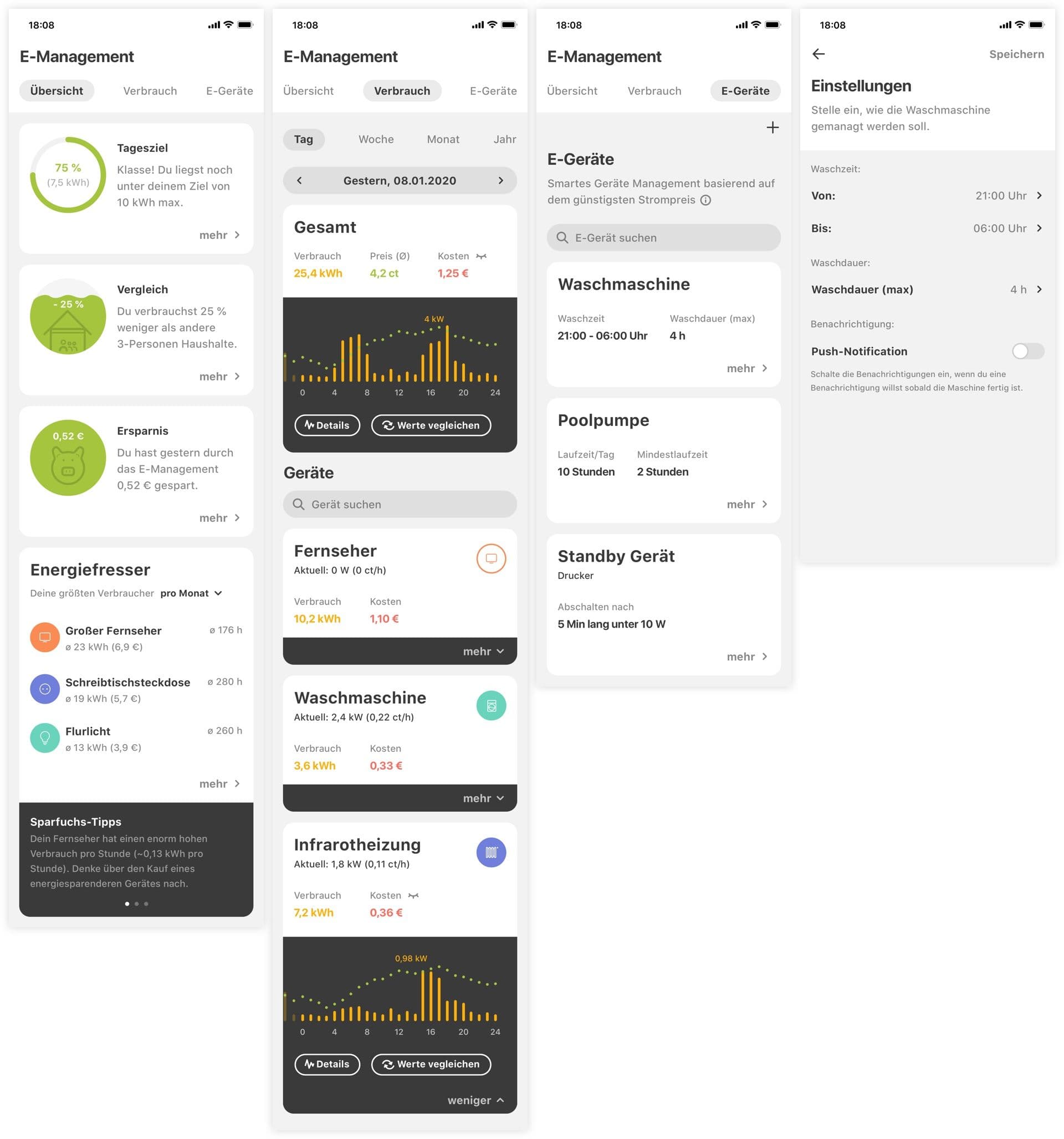
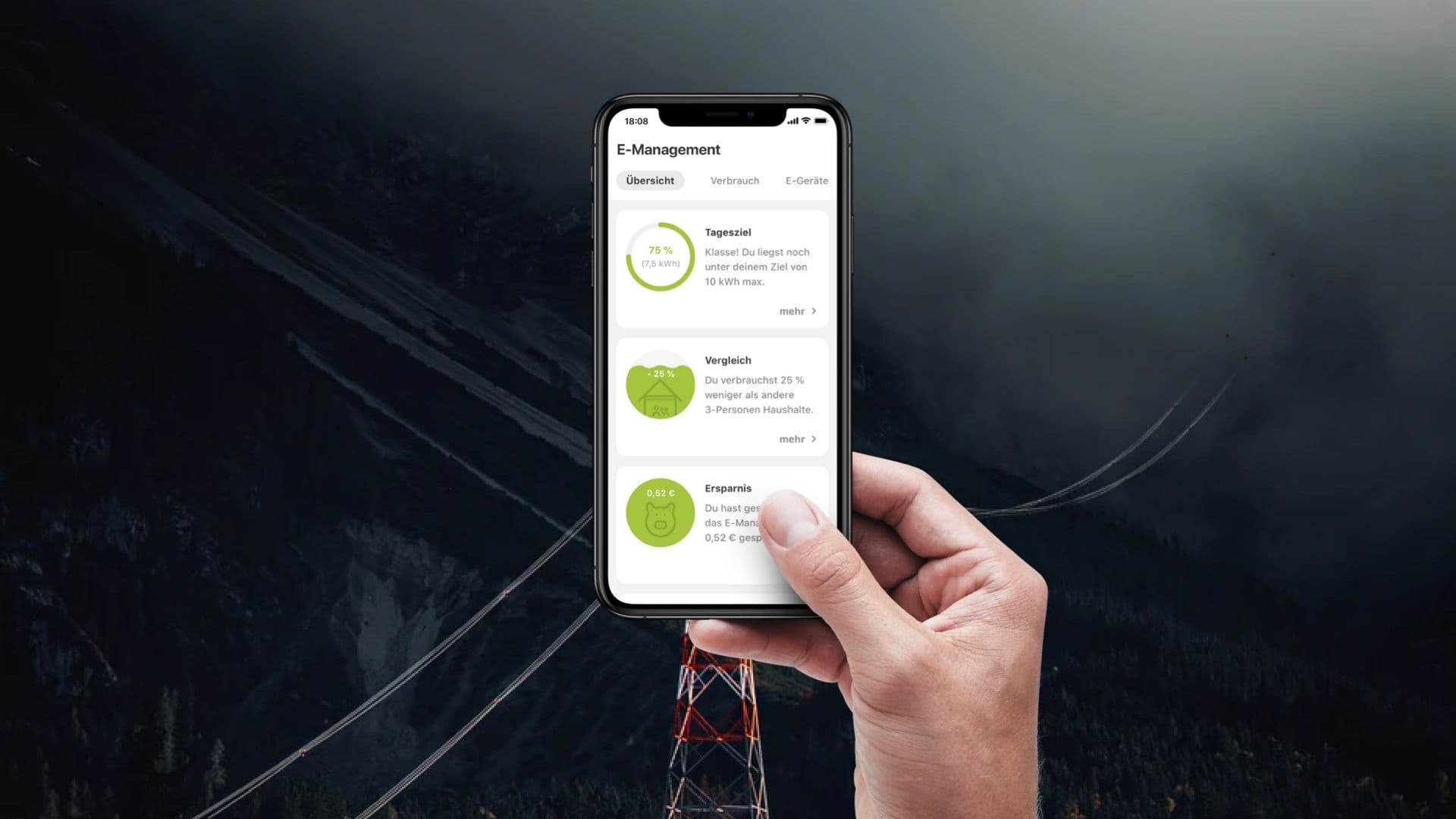
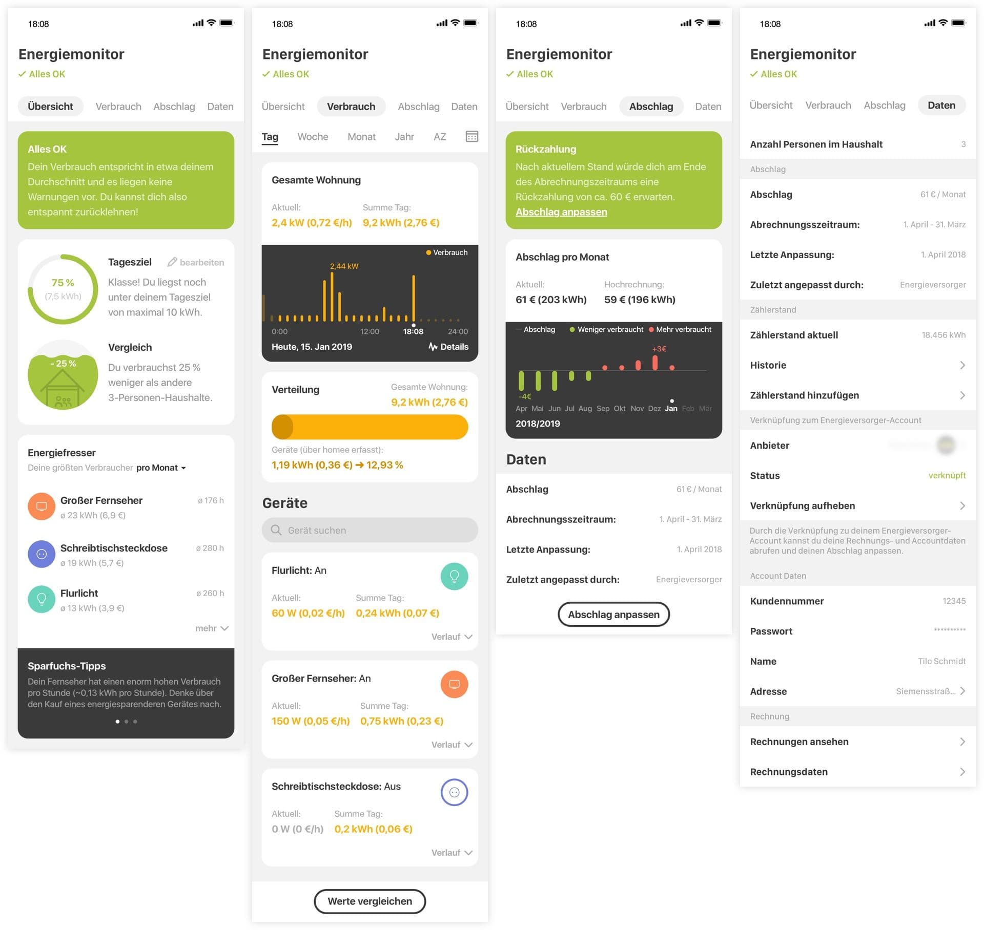
This case study is actually showing two seperate projects I was working on together with homee. Both were very closely related to each other regarding the content, goal and my contributions. One is a vision for an energy monitor with a focus on managing the energy consumptions and costs, the other one for managing the energy usage with smart cost related control mechanisms.
In both projects the goal was to create an early vision through a prototype to communicate to customers and get feedback on. The prototype was presented during a fair for exactly this purpose.
Basic human needs
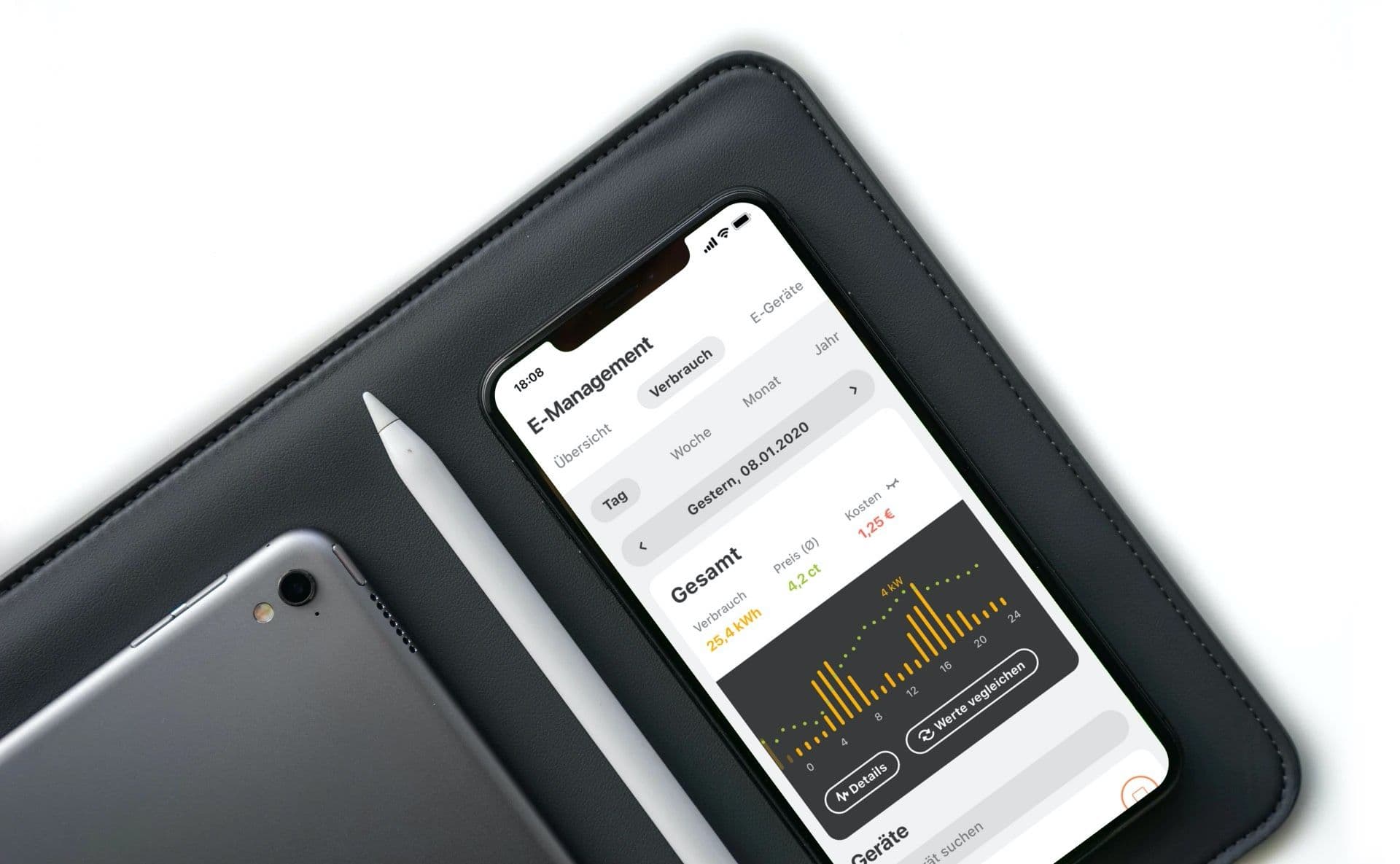
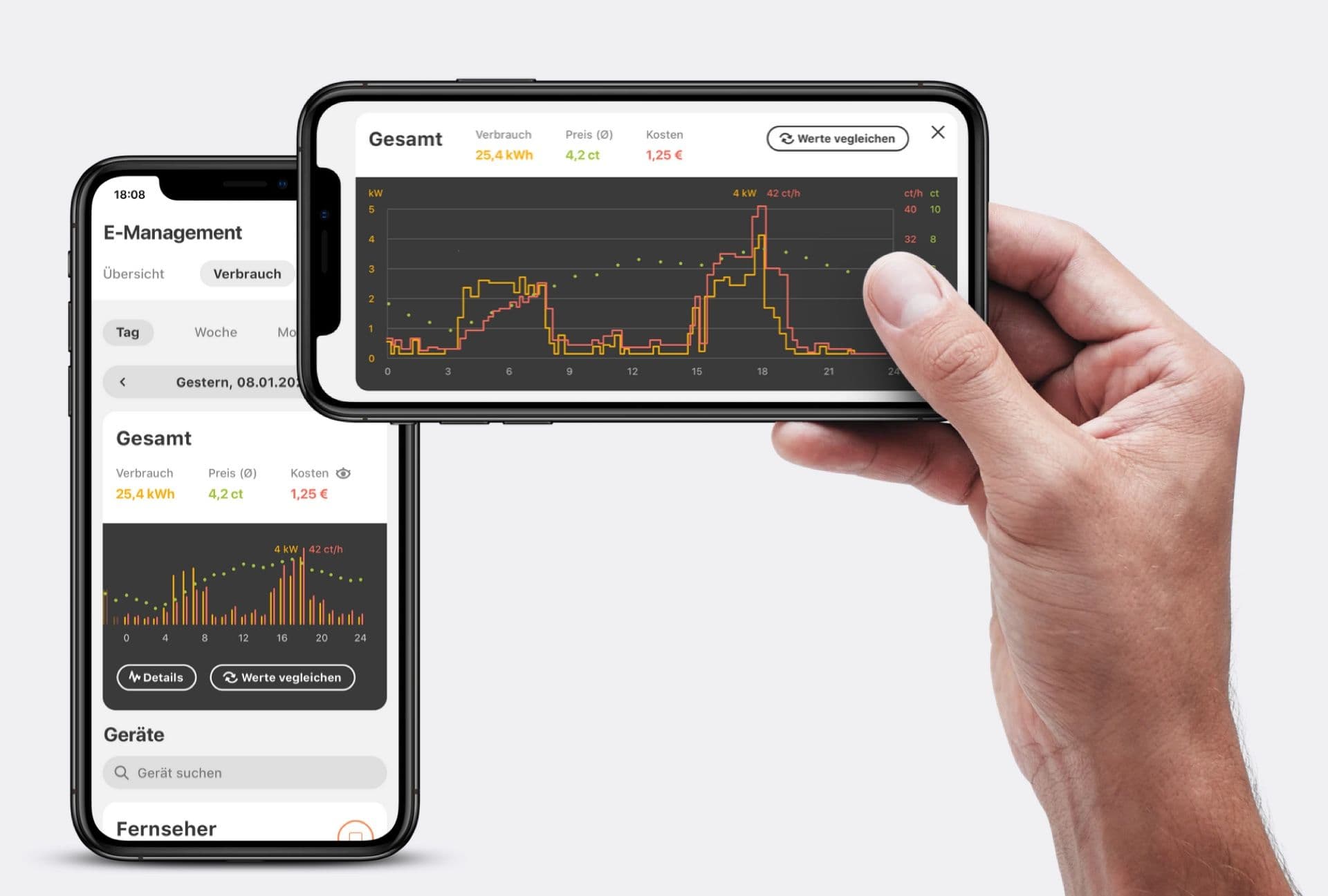
Humans have a strong need for securty which is often represented in a need for control. This was one of the very important underlying needs when forming this concept. It was the reason why I focused on visualizing the usage data and giving the user an overview over his consumption. Another important human need is the need for competence.
I planned to fullfill exactly this need when working with the idea to give the user the opportunity to compare his own usage to other households as well as setting personal energy goals. Of course visualization and feedback play a huge role in any of these cases.
Making use of behavioral design
For me personally it is important to create products that contribute to reducing energy consumption in order to protect our environment. And luckily enough most users are also interested in this. Some for the same reason, others in order to save money and most of them probably for both reasons.
These are the cases where I am willing to make use of the existing knowledge of psychology and behavioral design to direct the users behavior towards a specific outcome. I think it is important to be aware of this and I always like to ask myself if the user and the larger system will benefit from this.
Research, when no research was planned
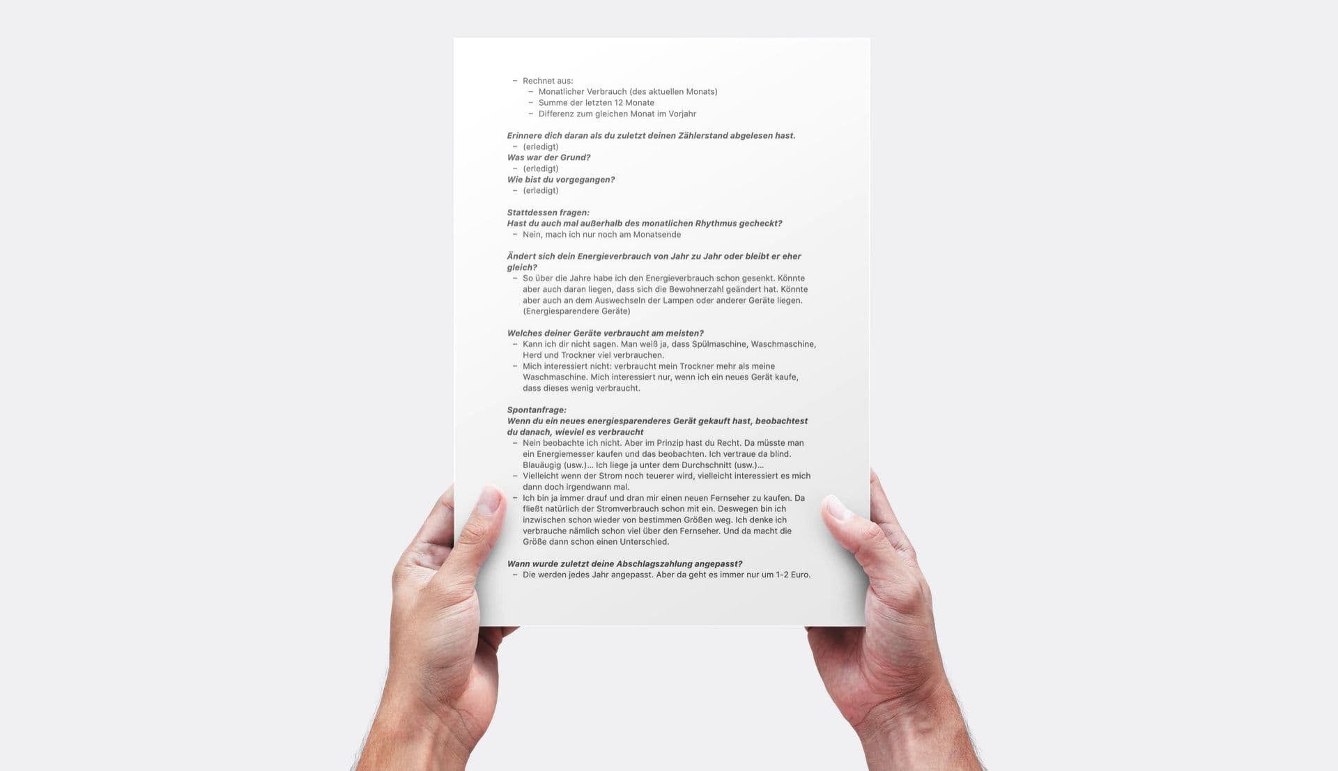
To check my assumptions I did some basic research. In both project neither time nor other resources were planned for research. In those cases I normally still do a little bit of research. First of all though I made use of the accumulated knowledge of the team. Some of them had been working in the energy sector for a long time and were able to provide me with important data. But I felt the need to talk to users to answer specific questions.
In this project I was able to find representatives of the target audience in my family. And instead of not talking to users at all, I decided to conduct an interview with my father which turned out to be very helpfull. Ideally I would have like to talk to at least 4 more people, but that was not possible for the reasons mentioned above.
Quick sketches and some brainstorming
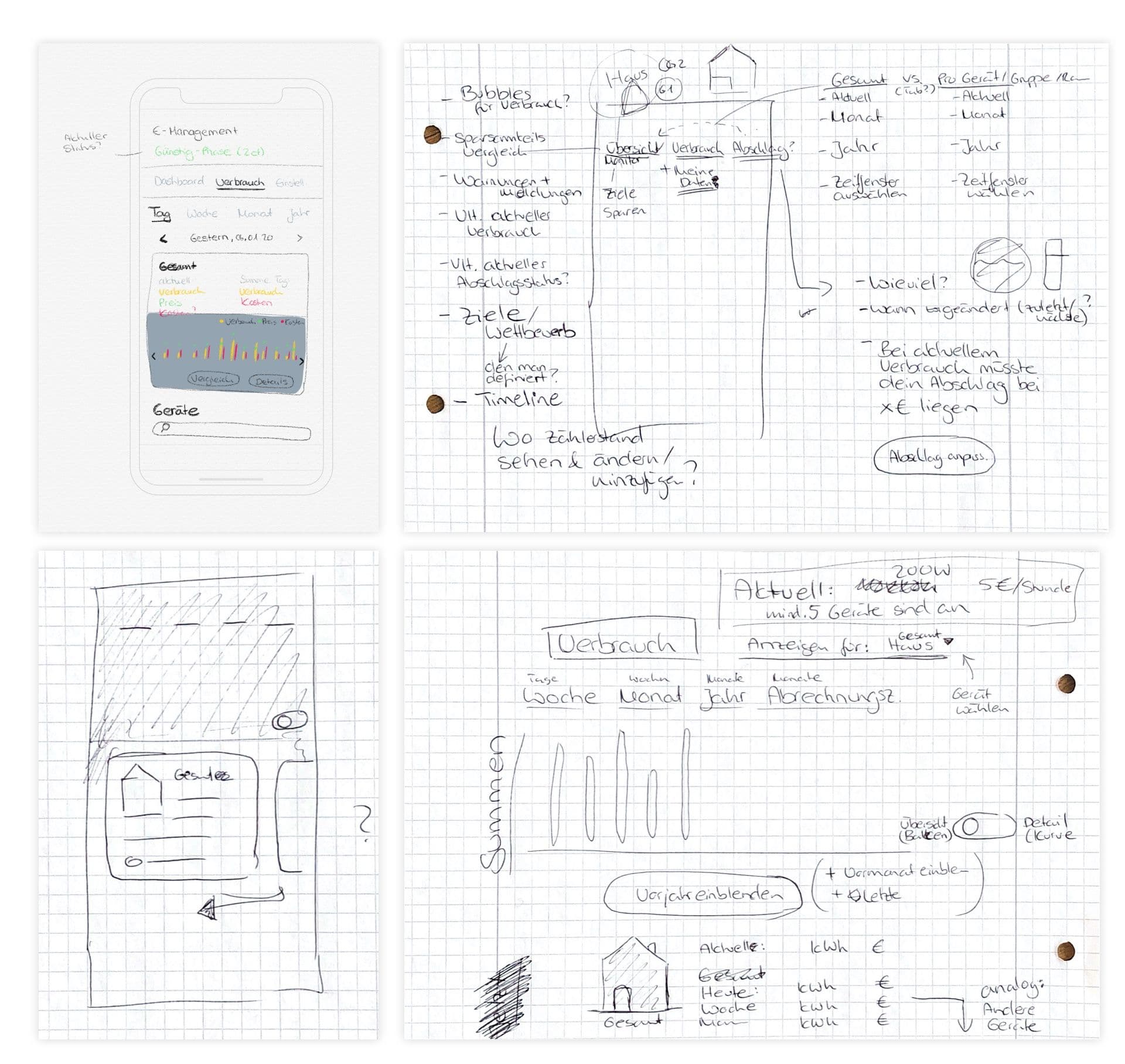
Quick sketches, some brainstorming, discussing ideas with the team and creating tables with data is all that I/we created before moving over to Sketch and designing the screens for the prototype. Since the goal was to quickly make a vision come to life in order to communicate and evaluate it (and not to actually realize it exactly that way), speed and some courage was our friend.
A clickdummy is all it needs
To bring a vision to life and figure out the strength and weaknesses of a concept, a clickdummy is usually all it needs. And that is exactly what we build in this project and presented during the fairs. I build the prototype in a way that it could be scaled to a huge touch display but also be presented on a smartphone – were it is intended to be used.
The endeavour was a great success and the client got a lot of valuable feedback from customers and/or potential customers.
