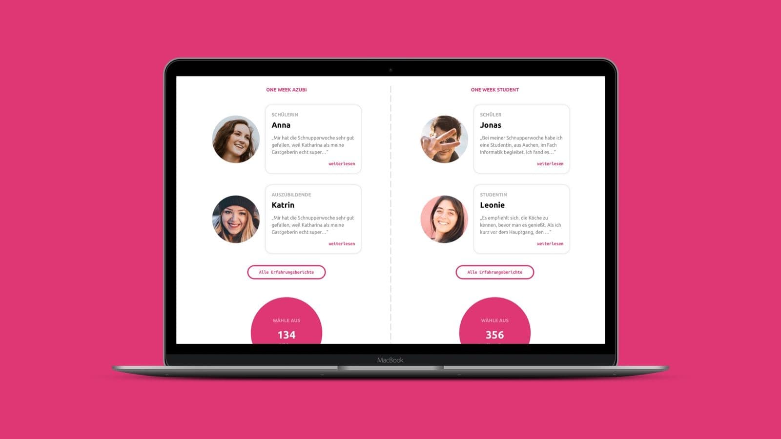
One Week Experience Website
UX DesignUI DesignDesign SystemScreendesignWebdesignWireframing

One Week Experience Website

One Week Experience
2017
About One Week Experience

One Week Experience Website

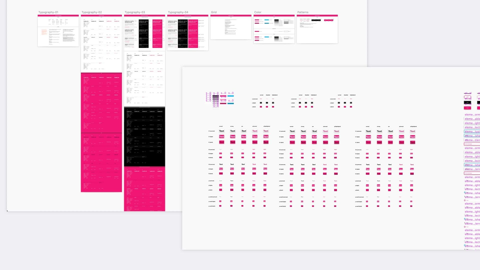
In this project – as it is the case in many projects – time was of the essence. Therefore I decided to provide the team with only a few screens and focused on also building out a Mini-Design System. Combined with the wireframes I worked out in the beginning of the project, they had everything they needed to build all missing pages by themselves.
One Week Experience Website
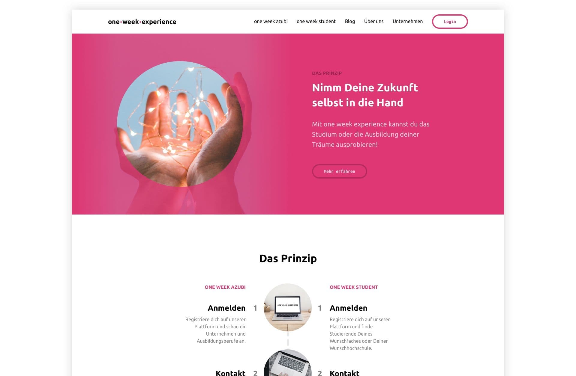
One Week Experience website
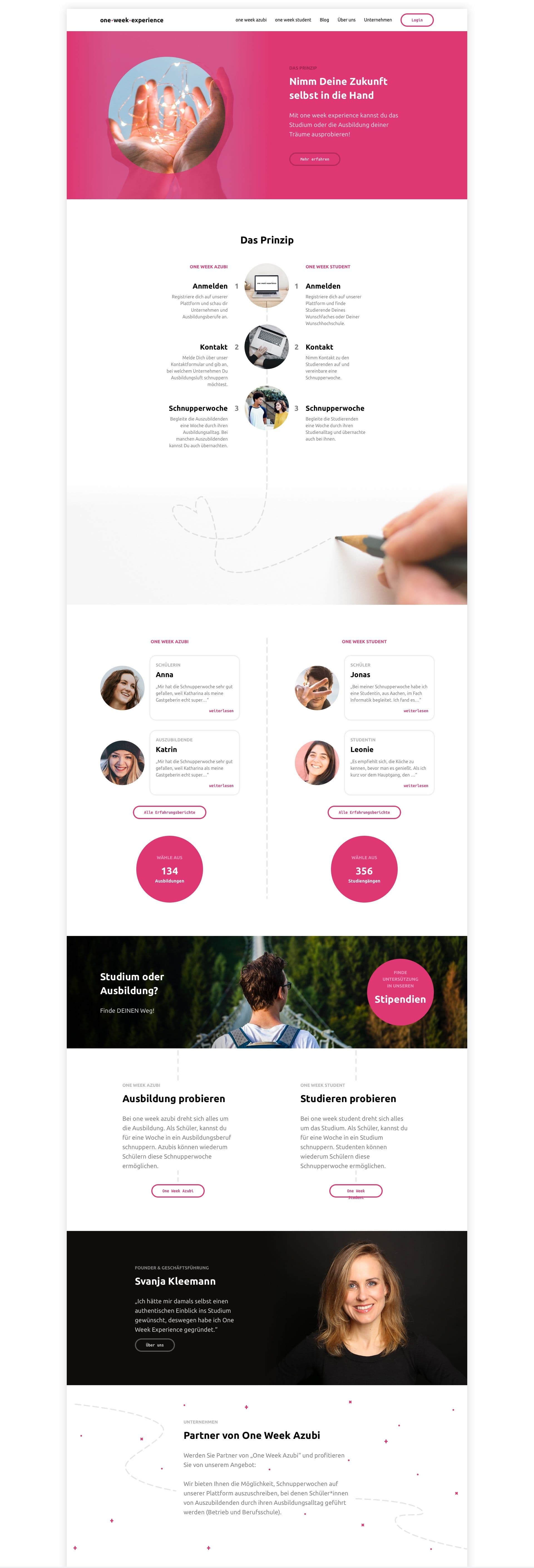
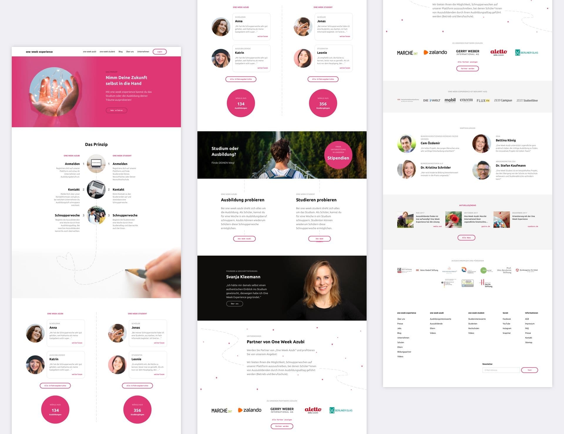
Homepage of the One Week Experience website
Mini-Design System consisting of a style guide and pattern library
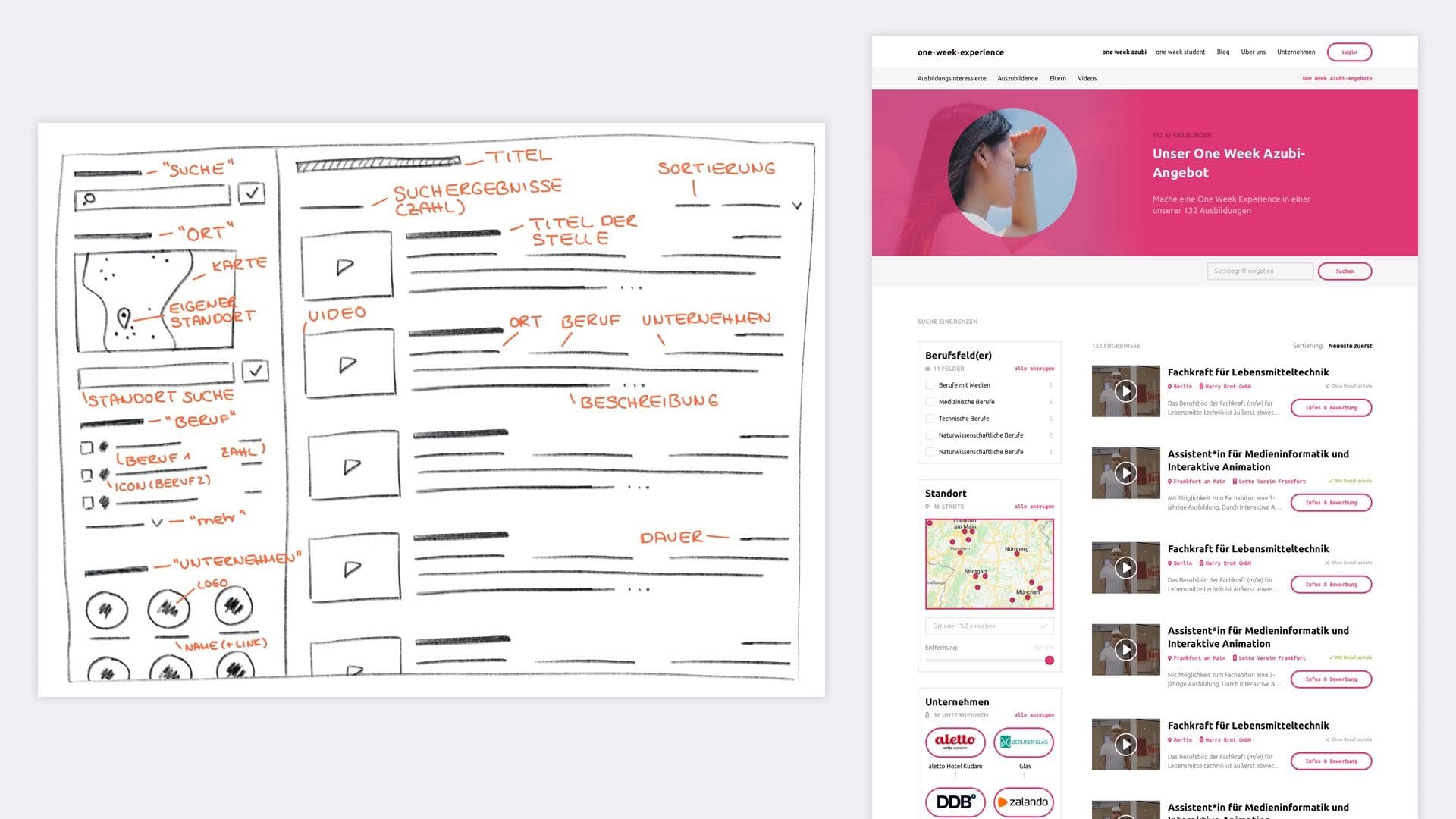
On the left a wireframe and on the right one of the drafts in Sketch of the apprenticeships

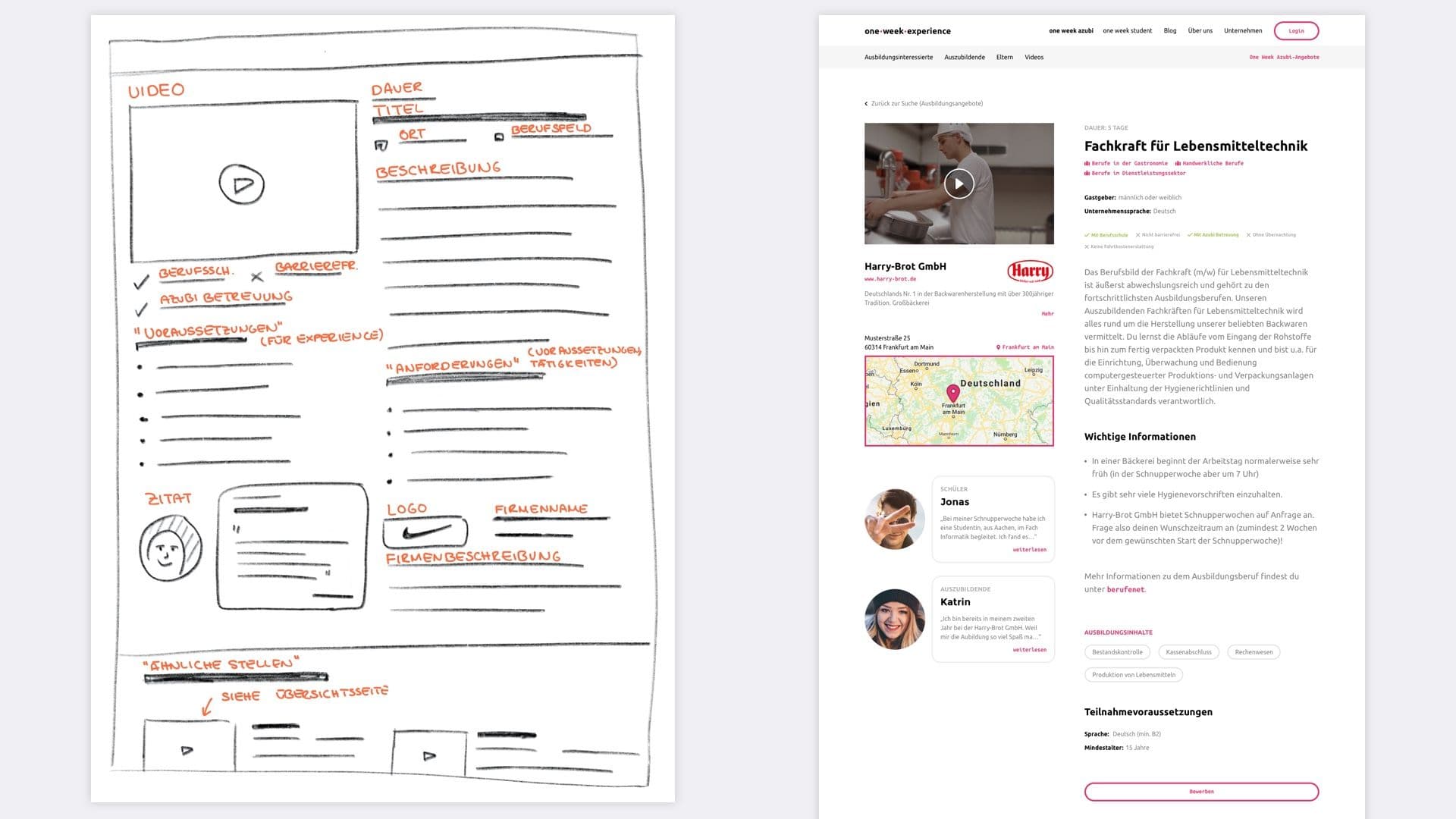
On the left a wireframe and on the right one of the drafts in Sketch of the apprenticeship detail page
 The OWE homepage
The homepage